Print brief research and planning
Research and planning blog tasks
Create a blog post called 'Print brief research and planning' and complete the following tasks to plan and prepare your print work:
1) Find at least five music magazine front covers (either current or former magazines as many have stopped their print editions) aimed at a similar target audience to your project (mainstream music audience) and research music magazine key conventions. For each one, pick out one design idea, convention or image/text style that you could use in your own print work.
First cover

Tame Impala Music Magazine front cover:
Shot: Close-up picture of the music actor's face (basically a portrait)
Background image: Plain white wall with High key lighting illuminating the star
Cover line: Contains buzz words that exaggerate the content of the music magazine phrases such as "7 exciting new artists" or "90+ reviews" amplify the reader's curiosity/attention reeling them into the magazine content.
Audience: Tame Impala is a mainstream artist therefore famous stars/celebrities must be referenced/included in your magazine front cover.
Colour scheme: Cover lines are a mix of red and blue. Even the outfit of the star is red blue perhaps intentional to make it easier to look at.
Second cover:

Shot: Compared to the first one this one is posed slightly differently,
Despite being a close-up picture you can see the body is positioned differently to the side and the star is turning to look at the camera another way I can shoot the front cover.
Cover lines: You have exaggerated cover lines that amplify the reader's curiosity. This magazine is designed to look sleek and clean not overwhelming the reader. A preview of what is in the magazine is in the top right corner.
Audience: Kanye a very mainstream artist who has amassed a cult-like following is exactly the type of audience I want to attract.
Colour scheme: Purple mixed with white. The white surrounds Kanye further increasing his presence on the front cover.
Third cover:
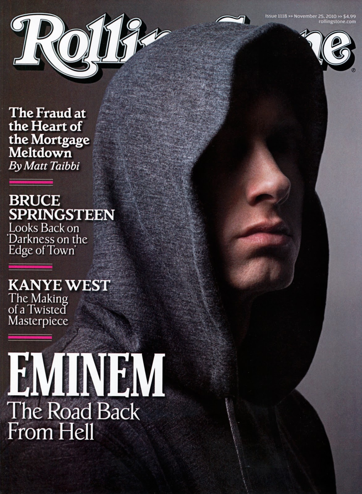
Shot: Close-up picture of Eminem like the Kanye one he is also tilting his head
Colour scheme: Black and white. Black creates this mysterious aura around Eminem.
Cover lines: The cover lines include very mainstream famous artists like " Kanye West" and "Bruce Springsteen" which can be found further in the magazine content.
Editing: Eminem's head is protruding over the masthead a key idea I will incorporate to make the magazine look more clean and professional.
Background image: The background image is of a Black wall, it doesn't fully illuminate the star
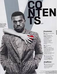
Fourth cover:

Colour scheme: The background colour is white along with a green mast line Black text lines are also mixed with green
Editing: The actor's head is edited in front of the masthead a neat trick to showcase the artist's presence more
Content of the frontpage: A variety and mix of different content is shown on the first page perhaps this is trying to demonstrate the sheer amount of quantity this magazine has

Mise en scene: Suit(formal), facial expressions are vibrant and loud perhaps to showcase the sheer amount of emotion he is feeling
Lighting: High key lighting highlighting the star's face
The use of reviews stating that it is "Britain's biggest music magazine" can attract a larger audience
The exaggerated quotes such as "50 BANDS YOU MUST SEE BEFORE YOU DIE" further support my point
Colour scheme: Black and white contrast really well with the outfit(black) contrasting with the background so much that it kind of illuminates the star in the music magazine cover.
2) Find at least five double-page spread features from music magazines on Google Images. How are they designed? How are text and images displayed? What design tricks can you borrow from your examples?
Conventions: use of drop cap (a really big letter at the start of a paragraph typically in Newspapers)
Design: One side of the page typically demonstrates the star of the music magazine followed by the other page with a 400-word interview with the said star.
Colour scheme: Consistently grey, fits in with the star's atmosphere/vibe oh him.
Audience pleasures: Para-social fans can interact and develop their relationship with the star by reading this personal 400-word interview it makes the fans feel some sort of connection.

Conventions: Drop Cap, seems like a showcase of their concert. Perhaps this is a concert review.
Design: The main title is cropped over the left side of the picture. ( good detailing and showcase of editing) . Furthermore multiple use of pictures across the two pages.
Colour Scheme: Black background, red colour text.
Audience pleasures: Fans can read this interview of the star and understand their daily lives much more
The images are used on the top left side of the two pages. It seems to overlap with the other page. A quote from the interview seems to be in the picture. No page numbers seem to be on the two pages. They designed it with the text at the bottom starting with a drop cap. A lengthy interview followed up by another star interview could be a good way to attract more audiences.

This is a medium shot of the star. The picture is displayed on the left side mixing in with the right. It seems to have blended in nicely rather than using contrasting colours to do the opposite effect. The typography is messy on the title opposed to the clean seraphim font.
3) Find at least five magazine content pages - ideally from music magazines - from Google images. How are they designed? How are images used alongside text? How are page numbers displayed?
It is designed with the star being positioned on the left taking up most of the page. It is a medium shot. Due to it being Kanye, the producers probably want to attract more audiences due to it being a massive music artist who has paved the way in the rap genre. The text is quite minuscule a far cry from the double-page spread features. The texts feature the page numbers on where to go. The colour scheme is a grey scale with only a burst of red on the heart. It kind of draws the reader's attention.

This is a unique contents page in my opinion since the producers have placed the camera above the star. This could mean many things but It could just be a unique camera shot. The content pages are quite heavy and take up around 50% of the content page. The colour of the text is black and yellow. Along with the star being surrounded by light (High-key lighting). The page numbers are also along the text.

This contents page covers two stars. A rapping duo called the "A-side". It is designed with the two stars on the right. The text on the left takes up most of the page. Page numbers are alongside the text on what the pages include. There is a quote on the right side on top of the picture perhaps a lyric from a song or a reference the targeted audience can pick up on. The accessories draped across the stars could interpret that they are gangsters or gang leaders typically talked about in their music videos.

A very simple concept of a contents page. You have the star on the left. It is a medium shot of the star crouched down. The contents page is across the right-hand side, and the page numbers are followed across the text directing any readers who need help. Very basic colour scheme with a white background and the text coloured in black.
4) Find at least five music artist tour posters from Google images. How are they designed? How are images used alongside text? Which UK venues would suit your artist or band? Some examples:

For the First Stormzy" music tour poster. You can that they designed the poster using vibrant colours to perhaps catch the reader's attention. The background could be where he came from originally, his hometown. This is further supported by the quote "Where do you know me from". A lyric from a song he might be hinting at or perhaps a reference about the past. For the second music tour poster, You can see that it is designed with a green background. Location is one of the biggest pieces of text informing where the concert is happening. His initials are placed in the middle. This is a medium shot of Stormzy shirtless with a crown on his head perhaps signifying that he is one of the kings of UK rap. All these details catch the reader's attention which is what I should incorporate. The Great Britain flag he is staring down at shows his roots.
For the third music poster, you can see that there is branding, most music magazines have advertisements from some corporations to endorse/convince their product, it's a win-win for both sides. The colour scheme is orange and white mixed with a hint of black. The location is given on the music tour poster.
The theme of the album or perhaps the song is a great indication of how you want to design your music tour poster. SZA the artist places her name at the top. You have all the countries and cities she is attending, She adds in the time as well. She has reused her album cover to make a music tour poster which is really efficient.
1) Plan the content and cover lines for your front cover:
- Title: Fate-less
- Slogan: "We do music right."
- Cover image: The background is dark with light bouncing off my head. I look up at the camera. My head is positioned slightly to the side so the light can bounce off my head. With the slogan off the side of my head. The glasses are off as they aren't in the best condition.
- Main cover story/main flash: Medium shot on the left-hand side of the next page. We have the title of the main cover story on the right page in the top middle extending slightly over the left side. We incorporate conventions such as a drop cap, and contrasting colours. Much smaller images perhaps that are plastered around the 400-word interview.
- Additional cover lines: I will need to grab the reader's attention so perhaps I should exaggerate aspects of my magazine like "MUSIC YOU WILL NOT WANT TO MISS" or " Music of a Lifetime" or perhaps add in reviews like "GRAMMY NOMINATED MASTERPIECE" to attract a much mainstream audience
- Additional two smaller cover images: Cool pictures have to be close-ups of other people perhaps just random people dancing in a concert as the pictures. I can pretend to be singing at a concert.
- Font style/colour scheme, additional design aspects: Black background, with white text along with red titles or cover lines.
2) Plan the images you will use for the front cover - use the elements of mise-en-scene (CLAMPS). One main image and two smaller images are required to meet the minimum content in the brief.
Make-up: Just vasa-line on the lips along with face cream to make my face more smooth. Perhaps I will style my hair to be more curly.
Costume: Indie artists wear more casual clothing with the occasional unique touch to it that makes it different. I will wear casual clothing nothing that stands out too much. I believe wearing a comfy hoodie will fit right into that vibe.
Lighting: I want the lighting to bounce off my face just to highlight me, the star more vibrantly. More off my jawline and cheek due to the background being dark my hair blends in more naturally so perhaps I should edit it to make it look more smoother.
Setting: The front cover picture will be done in the EF15 at school. Most of the shots will be done there if not I'll try to get more done.
Props: No glasses. However, I can perhaps use a football as a reference to the football that I used in my music video. A small cool detail that the audience can spot.
Plan the content for your inside page feature:
- Subject of feature:
- Headline:
- Subheading:
- Main image:
- Smaller images (need a minimum of four across the three pages)
- Font style/colour scheme, additional design aspect: Black background with red text
4) Write the 400-word interview feature you will use for the inside page spread. This must be 100% original and written by you. It may help to use a Q&A approach to this interview.
The interview starts here:
______________________________________________________________________________________________
In the congested scene of indie music. Where independent artists demonstrate their raw emotions through rhythmic beats. The artist " Friction" has made waves across the music industry. This artist combines emotional lyricism and a unique mix of genres. Instantly becoming a hit sensation to both critics and fans of the indie genre. We have sat down with the renowned star to discuss his journey and any influences that may have impacted his music and his future/past projects.
Interviewer: How would you describe yourself as a musician?
Friction: Independent. I make music to exhibit what's in my heart deep inside. I won't get that if I'm mass-commercialised and passed around as this "product." Audiences won't feel that sense of connection. Why should they? If I'm only looking for financial gain, I would be pumping out music day after day, but I won't, and that's my principle as a musician. Ultimately, my music is based on creativity, fluidity, and, most of all, individuality.
Interviewer: What instruments do you mostly play and what type of instrument would you like to play/learn in the future?
Friction: I mostly play the electric guitar, electric bass, and digital piano. I tend to use much more traditional rock band instruments. It has a very experimental and electric nature, capturing that feeling is why I use those instruments. To be honest, learning another instrument to me means mastering its full capabilities and that is somewhat time-consuming so maybe when I retire.
Interviewer: Who has inspired you to make music?
Friction: Artists such as Tame Impala or Daft Punk. Both incorporate elements of disco music. Tame Impala with mostly psychedelic rock and electronic music. Merging these styles improves my approach to making music.
Interviewer: Did you think that such success and fame would reach you in your lifetime?
Friction: It would be a lie to say that I didn't think that but who would? As a kid, I saw all the big players on screen serious world-famous music stars and they seemed untouchable I climbed those steps to reach that level but I noticed that there's nothing different from no fame and fame. Of course, there's the paparazzi or the media but I never felt special or powerful when I reached that status and I noticed that the version of me who wasn't so famous was the catalyst for me reaching where I was today. Basically, stick to your roots and don't expand too far otherwise you'll get lost to who you truly are. So in short no.
Interviewer: So any forecasts as to what's next for you?
Friction: Have you ever heard of the story "The Tortoise and the Hare"?
Interviewer: Yes many times. Why?
Friction: When I first started out I was the hare I rushed through many things and as a result of that I got lazy and kind of slowed down. I know that I don't want to do a disservice to my fans by rushing through and creating surface-level music that feels inferior to my other music projects. So, I will take it slow like the tortoise I will make sure that I take my time and that each of my projects has the utmost care and precision and that will really help with what's next in my career.
Interviewer: That's all for today, thank you for coming out here and doing this interview with us "Friction". It really has helped everyone understand how you go about things and the process behind the scenes of the production of a song and I appreciate that.
Friction: No problem. A final message to my fans thank you for sticking with me through this rough journey, some from the beginning of my career or others just discovering my music. I've had the privilege of making music that resonates with all of you. Through all the highs and lows, one thing has remained constant and that is your presence. Your love and energy are what keeps me going and I thank you for that.
Interview concludes
______________________________________________________________________________________________
5) Plan and write the text for your content page. This will need to include a range of features and interviews that are not related to your artist but that do fit your target audience and brief (mainstream music magazine).
Title/header: Labelled "Contents" or "What's inside" at the top. So readers can see that it is a guide. This will be in all Black.
Page numbers: Each feature or section listed on the contents page is accompanied by a page number. So readers are shown where each section is.
What is included in the sections?
Interviews: An interview with a music artist for example my one with "Friction" should be mentioned
Concert reviews, Features and Columns etc. Will help locate where the readers want to go specifically. Perhaps to indulge in their pleasures. Growing that personal relationship by reading the interview or surveillance, by learning where or how the concerts are, they can attend one in the future if possible.
6) Research and select the font or typography you will use for your magazine. This is a critical element of your print work - the brief requires a consistent house style running through all of your pages.
My genre of music is Indie. Then the typography should be unique, artsy and a bit unconventional but easy to read.
For the font, I believe I should use the Lora font or the Montserrat font.it is perfect for music magazines that make it feel more unique and special. It is essential for an indie artist to produce that electric style that captures my audience which is mostly mainstream.
7) Produce an A4 sketch of your front cover design and scan it/upload a picture to your blog
 8) Produce A4 sketches of your inside page feature with a clear layout of where headlinessubheadings, images and text will appear on the pages. Scan or upload a picture to your blog
 .9) Produce an A4 sketch of your content page design and scan it/upload a picture to your blog.
Photoshoot


1) Who do you need to photograph for your front cover and inside page images? Remember, you need seven original images across the whole print production. I will need a photographer to take photos of me. Already have two pictures of the front cover more will be coming soon. All will mostly be photos of me. I hope to take these photos soon so the whole idea will come together.
2) What camera shots do you need? Write a shot list or draw a storyboard for your photoshoots Make sure you plan a variety of camera shots you will look to capture - medium shots, close-ups etc.Shot 1: For the front cover, a close-up of my face. Facial expression will be very reserved and calm giving off that atmosphere of cool and collected.Shot 2: Perhaps for the smaller images I can have a close-up of me perhaps looking at the camera or singing my heart out.Shot 3: For the feature page, I am doing a wide or medium shot of me laying my foot on a football. Links well with the football in the last music video.Shot 4:
3) Plan the mise-en-scene. What costume, props or make-up will you require for your photoshoots?Make-up: Just vasa-line on the lips along with face cream to make my face more smooth. Perhaps, I will style my hair to be more curly. Costume: Indie artists wear more casual clothing with the occasional unique touch to it that makes it different. I will wear casual clothing nothing that stands out too much. I believe wearing a comfy hoodie will fit right into that vibe.Lighting: I want the lighting to bounce off my face just to highlight me, the star more vibrantly. More off my jawline and cheek due to the background being dark my hair blends in more naturally so perhaps I should edit it to make it look more smoother.Setting: The front cover picture will be done in the EF15 at school. Most of the shots will be done there if not I'll try to get more done.Props: No glasses. However, I can perhaps use a football as a reference to the football that I used in my music video. A small cool detail that the audience can spot.
4) Finally, note down the time and date for your photoshoots. This may be inside or outside school (or a combination of both). You will have Media lesson time for this after the mock exams.
I will mostly be shooting outside of school. This is so that I can find the perfect location for the wide/medium shots that I need to do. For the front cover, I believe using the school facilities EF05 can help with the front cover as I need a close-up of my face as shown here:

8) Produce A4 sketches of your inside page feature with a clear layout of where headlines
subheadings, images and text will appear on the pages. Scan or upload a picture to your blog

9) Produce an A4 sketch of your content page design and scan it/upload a picture to your blog.
Photoshoot
1) Who do you need to photograph for your front cover and inside page images? Remember, you need seven original images across the whole print production.


1) Who do you need to photograph for your front cover and inside page images? Remember, you need seven original images across the whole print production.
I will need a photographer to take photos of me. Already have two pictures of the front cover more will be coming soon. All will mostly be photos of me. I hope to take these photos soon so the whole idea will come together.
2) What camera shots do you need? Write a shot list or draw a storyboard for your photoshoots
Make sure you plan a variety of camera shots you will look to capture - medium shots, close-ups etc.
Shot 1: For the front cover, a close-up of my face. Facial expression will be very reserved and calm giving off that atmosphere of cool and collected.
Shot 2: Perhaps for the smaller images I can have a close-up of me perhaps looking at the camera or singing my heart out.
Shot 3: For the feature page, I am doing a wide or medium shot of me laying my foot on a football. Links well with the football in the last music video.
Shot 4:
3) Plan the mise-en-scene. What costume, props or make-up will you require for your photoshoots?
Make-up: Just vasa-line on the lips along with face cream to make my face more smooth. Perhaps, I will style my hair to be more curly.
Costume: Indie artists wear more casual clothing with the occasional unique touch to it that makes it different. I will wear casual clothing nothing that stands out too much. I believe wearing a comfy hoodie will fit right into that vibe.
Lighting: I want the lighting to bounce off my face just to highlight me, the star more vibrantly. More off my jawline and cheek due to the background being dark my hair blends in more naturally so perhaps I should edit it to make it look more smoother.
Setting: The front cover picture will be done in the EF15 at school. Most of the shots will be done there if not I'll try to get more done.
Props: No glasses. However, I can perhaps use a football as a reference to the football that I used in my music video. A small cool detail that the audience can spot.
4) Finally, note down the time and date for your photoshoots. This may be inside or outside school (or a combination of both). You will have Media lesson time for this after the mock exams.
I will mostly be shooting outside of school. This is so that I can find the perfect location for the wide/medium shots that I need to do. For the front cover, I believe using the school facilities EF05 can help with the front cover as I need a close-up of my face as shown here:


Comments
Post a Comment